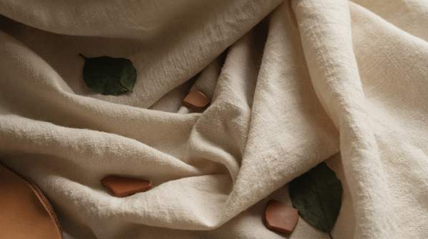
Spring/Summer 2027 resolves into three distinct color directions: grounded Earthy Naturals, ethereal Washed-Out Pastels, and expressive Saturated Accents. What unites them is not hue but material: the season's defining theme is sensorial authenticity, a demand for fabrics that breathe, caress the skin, and recall the earth's materiality. For designers and textile professionals, the sourcing decision and the color decision are now one decision.
Spring/Summer 2027: The Era of Sensorial Authenticity
The season's fabric direction, as described by Italian textile specialist Giulia Vellani in Pontex's Spring 2027 fabric analysis, is "natural, impalpable and fluid clothing fabrics, with colours and textures that recall flowers and finishes that appeal to the earth's materiality." The underlying need, in her framing, "translates into fabrics that 'breathe', into natural textures that caress the skin, into ethereal volumes that float at the first breath of spring wind."
For Spring/Summer 2027 the operative phrase is breathable lightness: surfaces that seem to vanish to the touch while still protecting against heat and external agents. Fabrics made predominantly of pure natural fibres and man-made fibres of natural origin are favored, enhanced by delicate washes and finishes that guarantee uniqueness, aesthetics, and resistance. Color strategy follows the same logic — a cotton-linen trend report from POP Fashion describes a framework of "interwoven lightness and depth, as well as juxtaposed cool and warm tones," anchored by everyday neutrals and punctuated by high-saturation hues.
Palette 1: Earthy Naturals – Grounded and Serene
The first direction builds on neutrals drawn directly from soil, bark, and herb gardens. Runway analysis of the New York shows documents taupe moving in from pink into washed taupes and saddle tones at Donna Karan, while the same collection closed its color story with basil and pistachio greens — sage family shades — before black and gold. Elsewhere in New York, designer Jane Wade named a mossy chartreuse her favorite shade, deploying it on technical sportswear and jersey.
The mood is grounded and serene, reflecting the season's broader connection to nature. These hues sit closest to the raw fiber itself, which makes them natural partners for the cotton-linens that POP Fashion identifies as the season's key substrate: on breathable natural weaves, taupe, moss, and sage read as texture rather than as applied color, deepening the tactile authenticity the season rewards.
Palette 2: Washed-Out Pastels – Ethereal and Soft
The second direction is powdery, pale, and herbal. Donna Karan opened in a powdery pink blush taken from a late-1990s campaign image, and Rio took the softening further with naturally dyed shirts and denim, using beets and berries to turn white into mauve and dusty rose. Pantone's Spring/Summer 2027 forecast, as reported by FashionUnited, places several entries at "the pale, herbal end of the spectrum," characterizing the overall selection as an interplay between the desire to be seen and a preference for the understated.
The aesthetic is subtle and sophisticated, with overall lightness moderately reduced rather than saccharine. These tones belong on surfaces that seem to vanish to the touch — the breathable, skin-caressing natural textures Pontex highlights — where a washed blush or mauve reads as an ethereal veil rather than a saturated statement. The Rio example is especially instructive for textile professionals: plant-based dyeing on shirting and denim is already delivering this palette on the runway.
Palette 3: Saturated Accents – Vibrant and Expressive
The third direction is the season's counterweight. Pantone's Color Institute forecast for New York Fashion Week includes loud entries — a deep red, a saturated orange, a vivid coral — that it frames as the "desire to be seen" half of the season's dual impulse. POP Fashion's cotton-linen analysis likewise reserves a place for "the visual memorability of high-saturation hues" within its otherwise neutral-anchored framework.
These accents are not a wholesale rejection of the season's quietness; they are its punctuation. Used sparingly against taupe, sage, or powdery pink, a deep red or vivid coral provides the contrast that keeps natural-fiber collections from reading as monotone. The palette's spirit, per the trend reporting, is individual expression and playful color connections — a single saturated piece within an otherwise understated, breathable collection.
Spring/Summer 2027 Color and Fabric Alignment
The table below groups the individual hues documented across the Pantone forecast, New York runway analysis, and fabric trend reporting into the season's three working palettes, then maps each to its most compatible material strategy. Use it to match a palette to your brand's aesthetic and your intended substrate before committing to dye lots.
| Palette | Key Hues | Aesthetic/Mood | Recommended Fabric Application |
|---|---|---|---|
| Earthy Naturals | Taupe, saddle tones, moss, sage/basil-pistachio greens | Grounded, serene, connected to the natural world | Breathable cotton-linen materials; natural weaves where color reads as texture |
| Washed-Out Pastels | Powdery pink blush, dusty rose, mauve, pale herbal shades | Ethereal, subtle, sophisticated; understated rather than sweet | Natural textures that caress the skin; breathable lightness; naturally dyed shirting and denim |
| Saturated Accents | Deep red, saturated orange, vivid coral, mossy chartreuse | Vibrant, expressive, playful; the "desire to be seen" | Strategic accent pieces — technical sportswear, jersey, single statement garments within neutral collections |
The reasoning behind these pairings is straightforward: each palette's visual weight must match the season's material logic. Heavy saturation on a stiff synthetic contradicts the sensorial-authenticity brief; the same coral on a breathable natural surface, or a washed mauve on fluid cotton, fulfills it.
Aligning Color with Fabric: A Tactile Connection
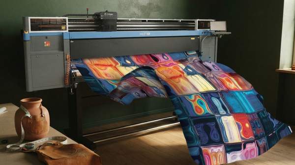
What makes S/S 2027 unusual is that the color forecast and the fabric forecast point at the same destination. Pantone's palette draws "on colors found in nature," while the fabric reporting demands natural fibres with delicate washes and finishes. The two trends reinforce each other: earthy and pastel hues flatter the subtle slub and hand of cotton-linen, while saturated accents gain their expressive force precisely because they sit against such quiet, tactile grounds.
For dye houses and mills, the implication is that color development and finish development should be briefed together. A dusty rose achieved through beet-and-berry dyeing, as Rio demonstrated, delivers both the hue and the natural-texture narrative in one process — a stronger commercial story than the same shade on a conventional substrate.
Actionable Insights for Spring/Summer 2027 Collections
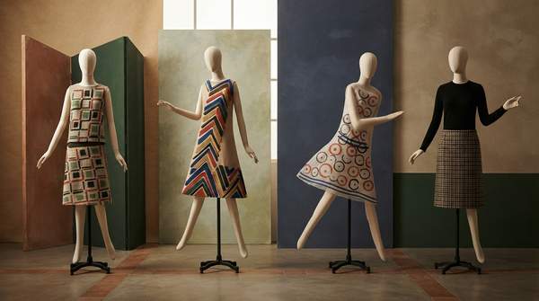
Designers and textile professionals should prioritize natural, breathable, and tactile materials, selecting color palettes that enhance sensorial authenticity while balancing understated tones with strategic saturated accents. The evidence supports a concrete allocation: build the collection's core in Earthy Naturals and Washed-Out Pastels on cotton-linen and other natural-fibre substrates, then reserve Saturated Accents for a small number of expressive pieces.
Two caveats frame this guidance. This is a trend forecast, not a definitive inventory of every color on the S/S 2027 runways, and it draws on published reports from New York and other major fashion weeks rather than every designer or collection. It also stops short of technical dyeing specifications — though the Rio example shows plant-based dyeing is already a live production route for the pastel palette. The measurable indicator to watch as the season develops: increased market presence of collections featuring natural fibers dyed in muted, earthy tones or soft pastels, complemented by vibrant, expressive accents.